Every semester, somewhere on your campus, a student with a visual impairment is trying to read a PDF that's actually just a scanned image. A student who's deaf is watching a lecture video with no captions. A student with ADHD is navigating a course with no consistent structure, where every week looks different and important information is buried in paragraph six of an announcement posted three weeks ago.
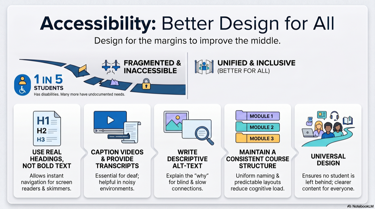
These aren't edge cases. Roughly 20% of college students have a documented disability, and many more have undocumented needs. Accessibility isn't a nice-to-have checkbox — it's the difference between a student who can participate in your course and one who can't.
The good news: making course materials accessible isn't as complicated as it sounds. Most of it comes down to good structure, clear formatting, and a few habits that, once built, take almost no extra time.
Why Accessibility Matters (Beyond Compliance)
Yes, ADA and Section 508 require accessible course materials. Your institution can face legal complaints if materials exclude students with disabilities. But compliance is the floor, not the ceiling.
Here's what's actually interesting: accessible materials are better materials. Period. For everyone.
- Clear headings help screen reader users and students skimming for key concepts
- Captions on videos help deaf students and anyone watching in a noisy library
- Consistent structure helps students with cognitive disabilities and every student trying to find information quickly
- Alt text on images helps blind students and students on slow connections where images don't load
This is the core insight of Universal Design for Learning (UDL): when you design for the margins, you improve the experience for the middle.
Document Structure: The Foundation
The single most impactful accessibility practice is proper document structure. This means using real headings, not just bold text that looks like a heading.
What "Proper Structure" Means
- Use Heading 1, Heading 2, Heading 3 in your word processor or LMS — in order, without skipping levels
- Use bullet lists and numbered lists via the formatting tools, not manually typed dashes
- Use tables for data, not for layout — and include header rows
- Left-align text — fully justified text creates uneven spacing that's harder to read for students with dyslexia
- Use sufficient white space — dense walls of text are difficult for everyone, but especially for students with visual or cognitive processing challenges
This matters because screen readers navigate by headings. A student using assistive technology can jump from Heading 2 to Heading 2, scanning the page the same way a sighted student scans visually. Without headings, they have to listen to the entire document linearly.
If you're building course materials from a course outline, you already have a natural heading structure: module titles become H2s, topics become H3s. The outline does the accessibility work for you.
Multimedia: Videos, Images, and Audio
Video
- Add captions to all videos. Auto-generated captions (YouTube, Panopto) are a start, but they're typically 70-80% accurate. Review and correct them — especially for technical terminology in your discipline.
- Provide transcripts for students who prefer reading or can't access video at all.
- Describe visual content verbally. If you point to a diagram and say "as you can see here," a student who can't see the screen gets nothing.
Images
- Write alt text that describes what the image shows and why it matters in context. "Figure 3" is useless. "Bar chart showing unemployment rising from 4% to 9% between 2008-2010" is functional.
- Don't use images of text. If you have a quote or a chart label, type it as actual text. Images of text can't be read by screen readers or resized without pixelation.
Audio
- Provide transcripts for podcasts and audio lectures.
- Don't rely on audio alone to deliver critical course information.
LMS Setup: The Invisible Accessibility Layer
Your LMS is where students interact with your course daily. A few setup choices make a major difference:
- Use consistent module naming — "Module 1: [Topic]," "Module 2: [Topic]" — never just "Week 3 Stuff"
- Post a weekly overview at the top of each module explaining what's due and what to do first
- Use meaningful link text — "Read the assignment guidelines" not "Click here"
- Avoid color as the only indicator — don't mark important items in red if color is the only signal
- Test in student view — navigate your course as a student would, linearly, from top to bottom
For online courses and hybrid courses, LMS accessibility is especially critical because the LMS is the classroom for much of the week. A confusing, inconsistently structured LMS is the equivalent of a chaotic physical classroom where the whiteboard changes location every day.
Assignments and Assessments
Accessibility in assessment means giving students multiple ways to demonstrate learning — not lowering standards.
- Offer format flexibility where possible. Can a student record a video response instead of writing an essay? Can they submit a diagram instead of a paragraph? If the learning objective is "analyze the causes of the Civil War," the format of that analysis is less important than the analysis itself.
- Provide clear rubrics in advance. Students with learning disabilities benefit enormously from knowing exactly what's expected. But so does everyone — this is the same principle behind effective feedback design.
- Build in adequate time. Timed assessments with no extended-time option disadvantage students with processing speed differences, anxiety disorders, and physical disabilities. Consider whether the timer is actually measuring the learning objective or just measuring speed.
- Write discussion prompts that don't require specific physical experiences. "Describe a time you ran a marathon" excludes. "Analyze a decision you made under pressure" includes.
The Low-Effort, High-Impact Checklist
You don't need to overhaul your entire course at once. Start with these five changes that take minimal time but make the biggest difference:
- Convert one document to proper headings. Pick your syllabus. Apply real H1/H2/H3 formatting. Notice how much more navigable it becomes for everyone.
- Add captions to one video. Start with the most-watched one. Auto-generate, then spend 10 minutes correcting.
- Write alt text for images in one module. If an image is decorative (adds nothing informational), mark it as decorative so screen readers skip it.
- Check your color contrast. Use a free tool like WebAIM's contrast checker on your slides. If text doesn't pass at 4.5:1 ratio, bump up the contrast.
- Add a consistent structure to one week in your LMS. Then copy that structure to every other week.
Each of these takes under 30 minutes. Do one per week and your course is meaningfully more accessible within a month.
A Note for Adjuncts and Faculty With Limited Time
If you're managing multiple preps and thinking "I don't have time for this" — you're right that accessibility shouldn't be yet another unpaid burden on adjunct labor. Institutions should provide support, training, and time.
But here's the practical reality: building accessible materials from the start takes almost no extra time. Retrofitting inaccessible materials later takes enormous time. The most efficient approach is to use well-structured templates and tools that generate content with proper formatting built in — headings, lists, clear language, logical flow — so accessibility is baked into the output rather than bolted on after.
The Standard, Not the Exception
Accessible course materials shouldn't be something you create "for that student with the accommodation letter." They should be the default — because they're better materials for every student. Clear structure. Consistent navigation. Multiple formats. Explicit expectations. These aren't accessibility accommodations. They're just good teaching.
CourseDev generates course materials with clear structure, proper heading hierarchy, and consistent formatting across every module — making your content more accessible from the start. Try it free.